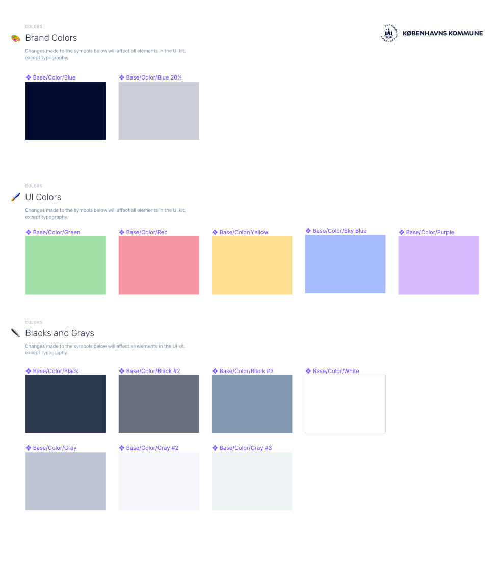
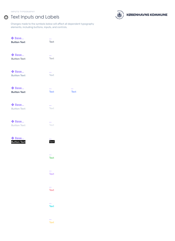
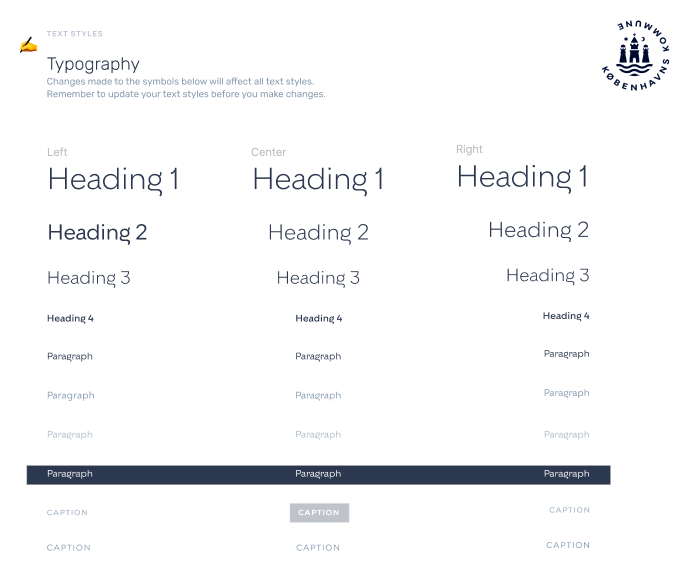
The City of Copenhagen project involved optimizing the ServiceNow CMS Portal which was a critical system used for managing their supply chain. As the UX designer, my primary focus was to improve the usability and functionality of the portal by streamlining the user flow, simplifying the navigation, and ensuring that the design aligned with the City's branding guidelines.
During this project, there was a limited research budget, so I conducted a heuristic evaluation to identify the UX issues within the system. Based on the results, I prioritized the elements that would have the most significant impact on the user's experience while being mindful of the budget constraints.
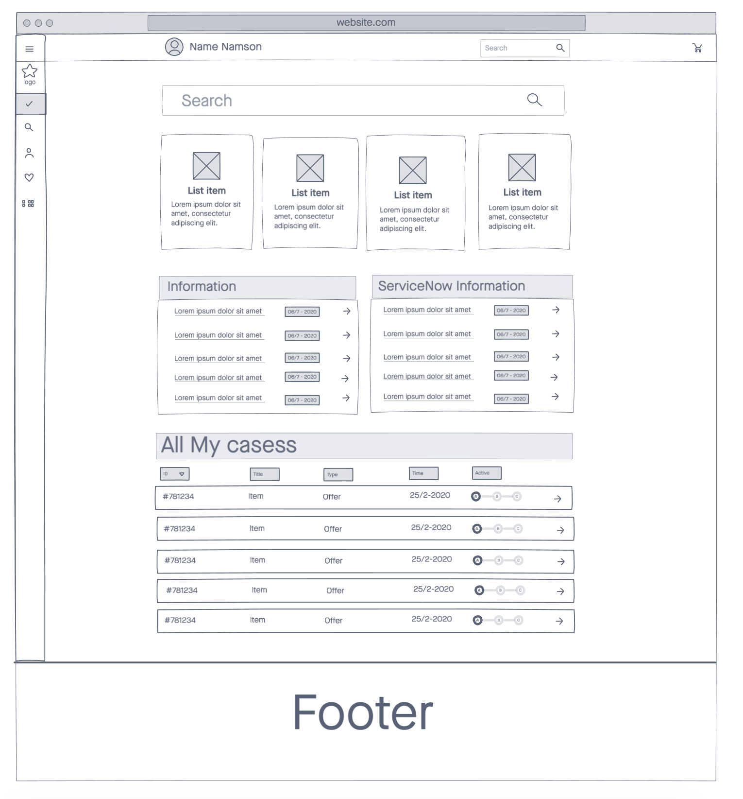

To ensure that the wireframe aligned with the needs of expert users, I conducted a series of interviews to gather their feedback on the existing Supply Chain platform. Through this process, I was able to gain insights into their pain points and areas of frustration. Using these insights, I sketched out a wireframe that addressed their concerns and incorporated their suggestions for improvements. This approach helped to ensure that the wireframe was user-centered and optimized for their specific needs.
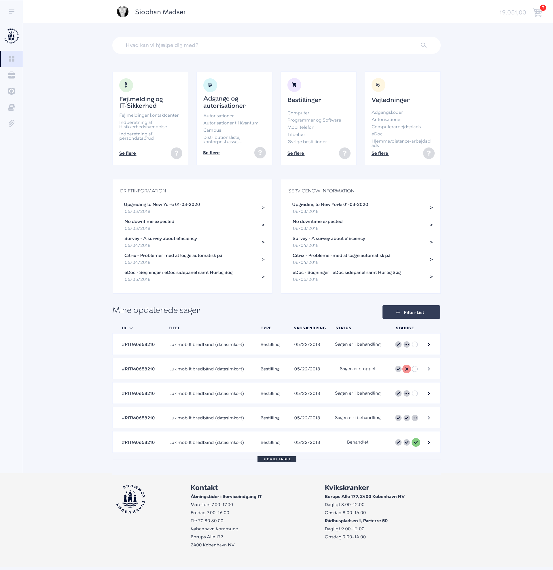
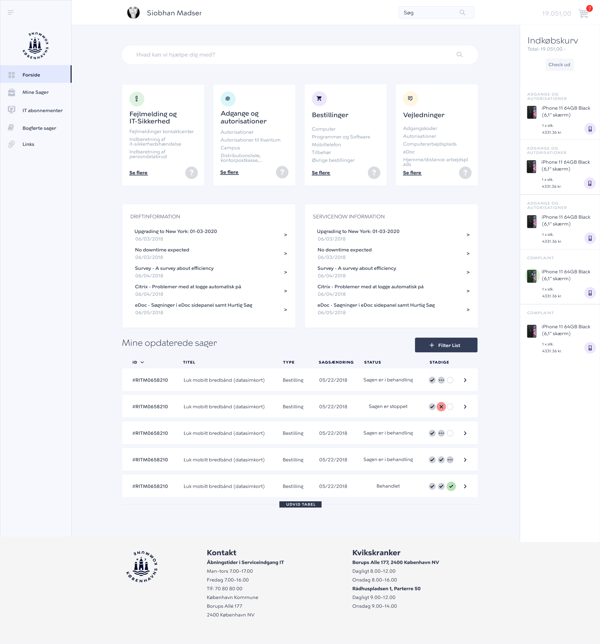
Designing and prototyping in Sketch and then later when COVID-19 and working from home were mandatory I converted the entire project to Figma
Considering the user needed to get to their destination quickly I tried to hide what wasn't important to them and centralize the content in the grid.
During usability testing, I observed that the users often resorted to using the search function on the website because the navigation structure was confusing and inefficient. They had to navigate through multiple categories to find the appropriate form or product, which led to frustration and wasted time.
To address this issue, I conducted a comprehensive analysis of the site's information architecture and reorganized the entire categorization system to make it more intuitive and user-friendly.
I also added the most frequently used links under each category tile to enable users to quickly find what they need. This redesign significantly improved the user experience and streamlined the navigation flow on the site.
I also added the most frequently used links under each category tile to enable users to quickly find what they need. This redesign significantly improved the user experience and streamlined the navigation flow on the site.
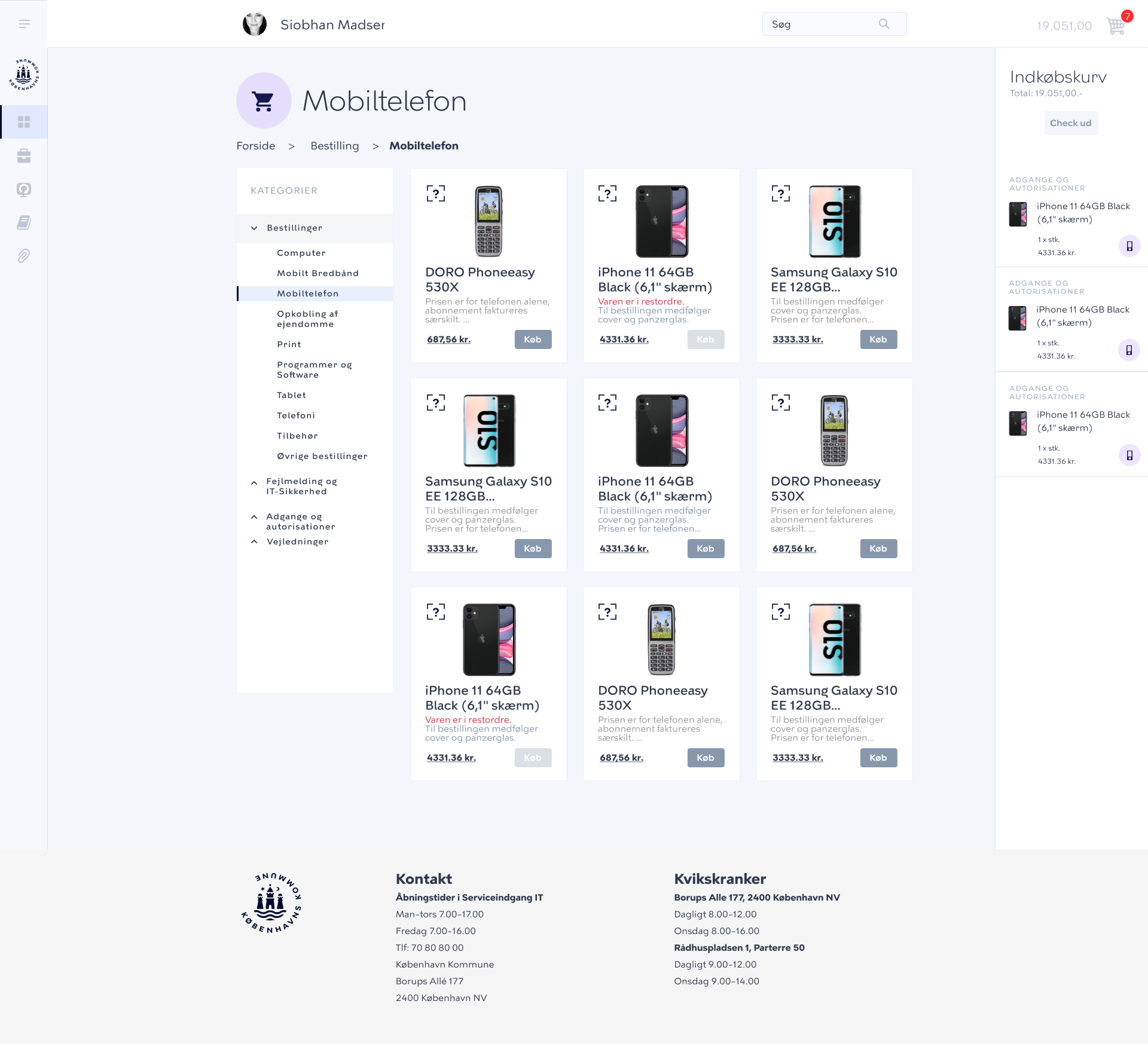

The super user called "IT Requester" wanted the functionality to quickly inspect and compare products and IT requests.
The solution I used was to have the tiles open and close to reveal more content without breaking the user's flow by loading a new page.
